
Article by Ben Griffis
The 2020/21 Premier League season ended in May with Manchester City being crowned champions. In this article I’ll show a few graphs that look back at the season and offer some insight into the teams and players.
First, let’s start off with a graph showing the points by round for each team.

This shows City’s dominance starting halfway through the season. They were doing alright at first, but quickly jumped ahead of the other title contenders with a string of victories. This graph also shows Leicester’s late-season falter from challenging for 2nd to ending out of the Champions League spots in 5th, as well as Liverpool’s late surge to earn the 3rd spot and secure Champions League football next season.
At the bottom of the table, we can see Sheffield United’s terrible season after a surprisingly strong performance in 2019/20 when they finished 9th as a newly-promoted side. West Brom as well struggled to earn points, and never looked like they could be saved. Fulham, on the other hand, did well to recover from being off the pace, looking like they would continue their escape past round 27. However, after a series of good results to catch up with Brighton and Newcastle, they only earned 2 more points the rest of the season.
This graph is fun to look at because you can clearly see the different tiers teams performed in this season. Champions City were head and shoulders above all others. You can see the teams battling for Champions League football just below Manchester United, and then the group battling for the final Europa League and Conference League spots. We see the mid-table group from Wolves to Burnley, and Aston Villa just above them with a late-season push towards the European battlers. Finally, the 3 relegated sides were, by round 30, just about decided and their points haul is notably different than the others.
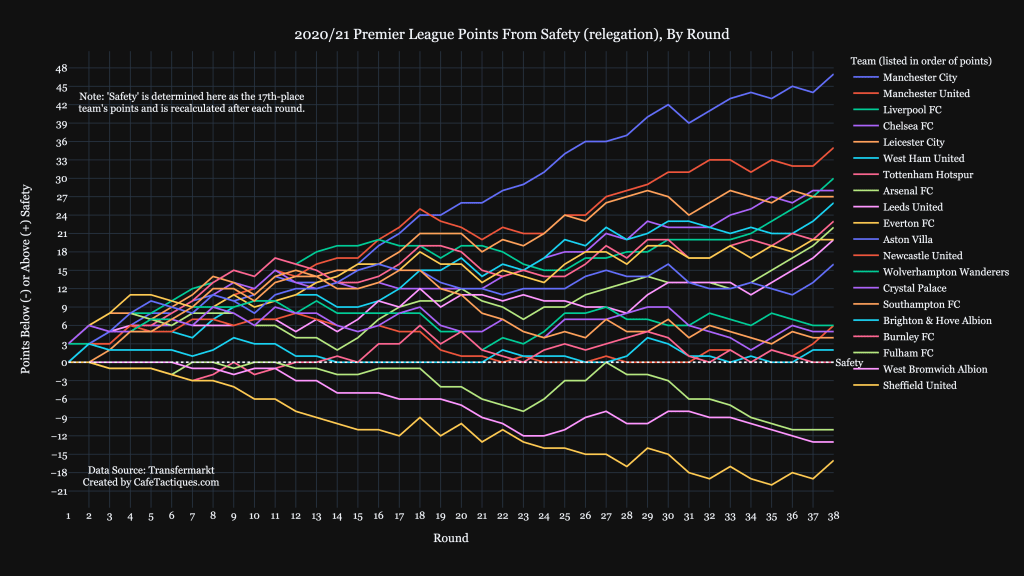
The above graph shows the “points from safety” for all teams over the season. The points required to be “safe” is calculated as the 17th-placed team’s points, because any number of points below them and that team is in the relegation places of 20, 19, or 18. This is recalculated each round.
This graph is similar to the points by round but with a different frame of reference. It allows us to see how close any teams were to being safe, or how close they were to being in danger of relegation. In round 14, Arsenal were 2 points clear of safety, and the next-closest they got to danger was 7 points in round 23. Even with a poor season, they were never in any real danger of relegation, even though fans of Arsenal and rivals Tottenham were joking early on in the season.
This graph perfectly illustrates Fulham’s missed opportunity to remain in the Premier League another season. In round 27 they finally hit the safety level, but then slipped again, ending the season 11 points clear. West Brom and Sheffield both looked headed for relegation early on in the season.
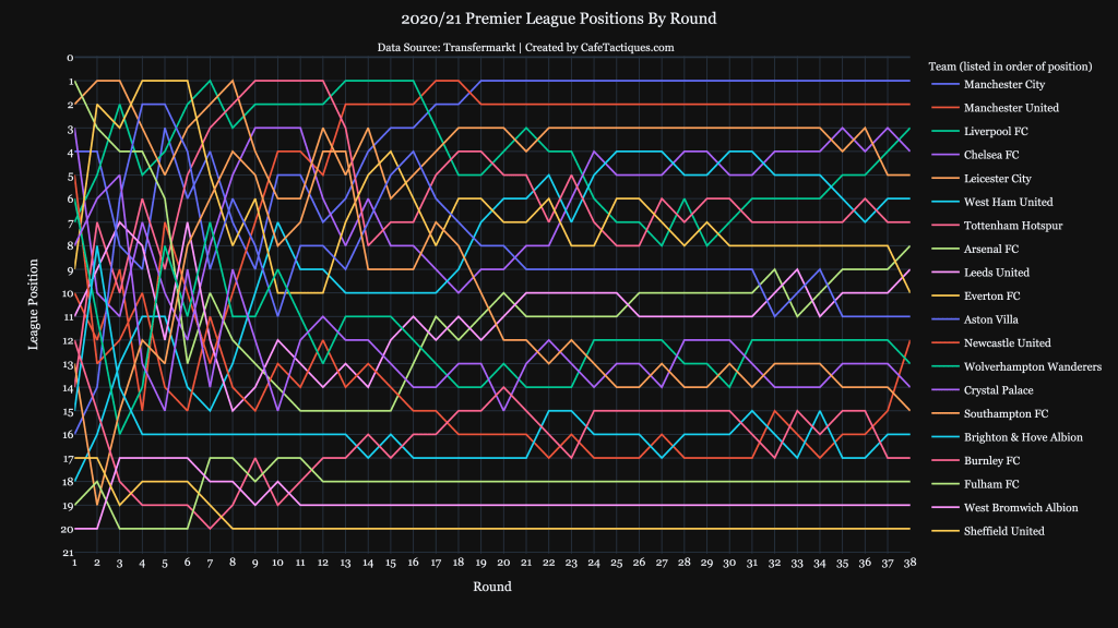
This final chart dealing with the teams shows their positions at the end of each round. It’s difficult to read at first with all the movement early in the season, but by midway we can track rises and falls in some teams. Tottenham is an interesting one to follow, logging 4 consecutive rounds in 1st, starting in round 9. After that they quickly dropped to 8th (from 1st in 2 weeks) before climbing back to 4th for 2 rounds. Spurs then struggled to stay in the Champions League race and hovered around 6th and 8th, before finally ending in 7th place to earn Conference League qualification.
This graph also shows Manchester City’s march from 7th to 1st between rounds 12 and 19. Once they earned the top spot they never let it go. Everton, interestingly, had a similar season to Tottenham. Everton held the top position for 3 rounds early in the season before quickly dropping and ending out of the European spots they occupied for the majority of the season.
The final team I want to call out is Newcastle. They were hanging around 17th for much of the second half of the season, but good results saw them jump up to end the season in 12th. One of the reasons I like this chart is so we can see a team jump up or fall many positions in quick succession.
Next, we will move to looking at charts of player performances.
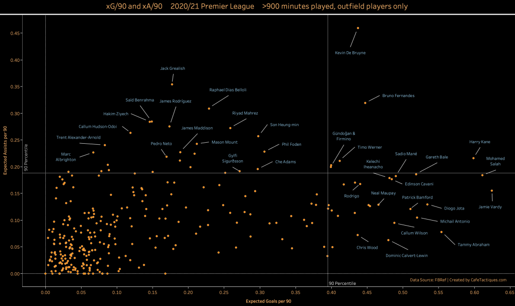
The above chart plots players’ Expected Assists (xA) per 90 minutes and their Expected Goals (xG) per 90 minutes. This allows us to see which players contributed the most to their team’s attack over 90 minutes, and if they were mainly goal threats, passing threats, or both.
Two players stand out, Manchester City’s Kevin De Bruyne and Manchester United’s Bruno Fernandes. Both players were in the 90th percentile for both xG and xA per 90, as were a few other players, but they are outliers with their very high xA compared to xG. Both De Bruyne and Fernandes were big goal threats while being 2 of the 3 biggest assist threats for the season. Aston Villa’s Jack Grealish come in second behind De Bruyne for the largest xA/90 this season.
Tottenham’s Harry Kane is another player of note in this chart. The Spurs talisman was, as usual, one of the biggest goal threats in the Premier League this season. However, he also was in the 90th perdentile for xA/90, showing his game’s evolution this season into not just the top goalscorer, but also the top assister. He and Son Heung-min broke the single-season goal combination record way back in March, when they hit 14 combinations between them, mainly stemming from Kane’s assists to Son. Kane also tied the Premier League record for most assists in a single game, recording 4 against Southampton on September 20th, 2020—all 4 were to Son Heung-min.
Chelsea’s Timo Werner, Manchester City’s Ilkay Gundoǧan, and Liverpool’s Roberto Firmino were also in the 90th percentile for both xA/90 and xG/90.
Interestingly, Tottenham’s Gareth Bale, on loan from Real Madrid, was one of the biggest xG threats per 90 minutes this season, despite playing just 920 minutes after recovering from injury/fitness early in the season and José Mourinho’s reluctance to play him for long stretches in the middle of the season.
A final player to mention (but please look at the rest of the graph yourself!) is Leicester City’s Jamie Vardy. Vardy was the biggest goal threat per 90 minutes this season, a testamnet both to his quality and to Leicester’s ability to feed him season after season.
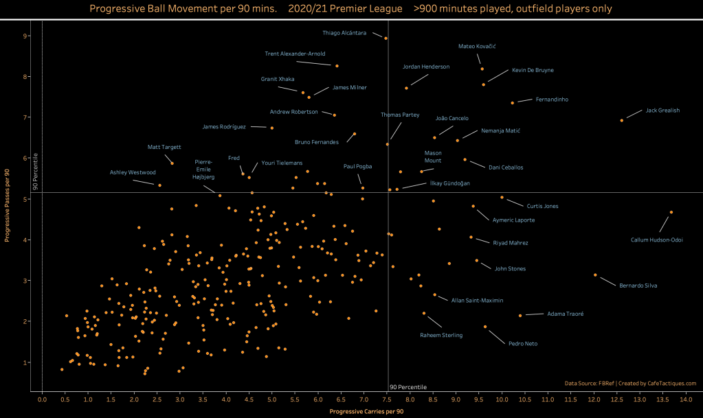
This next graph looks at players’ progressive ball movement per 90 minutes—progressive carries and progressive passes.
There are more players in these statistics who are 90th percentile in both stats compared to the previous xA and xG per 90. As the trend shows, many times if a player is a progressive passer they are also a progressive carrier. However, that isn’t always true, as some players were average progressive passers but top progressive carriers. Players of this profile include Newcastle’s Allan Saint-Maximin, Manchester City’s Bernardo Silva, and Wolves’ Adama Traoré. These players make many progressive runs during a game, but relatively few progressive passes. They will receive the ball and look to march up the pitch rather than play a decisive progressive pass.
Players of the opposite type are top progressive passers but don’t progressively carry the ball often. Players like this include Everton’s James Rodríguez, Leicester’s Youri Tielemans, and Aston Villa’s Matt Targett.
Aston Villa’s Jack Grealish is one player who is top in both progressive carries and progressive passes. Adding in what we learned from the xA/90 and xG/90 graph, Jack Grealish comes out as one of the best attackers in the 2020/21 Premier League. He’s integral to Aston Villa and the data shows that. Further, Kevin De Bruyne is 90th percentile in both progressive passes and progressive carries as well, showing his attacking dominance too. Other players in the 90th percentile of these two stats include Chelsea’s Mateo Kovačić, Liverpool’s Jordan Henderson, and Manchester City’s Fernandinho. Typically, these players are central midfielders who have space in front of them to run into and enough space to spray passes to advanced teammates.
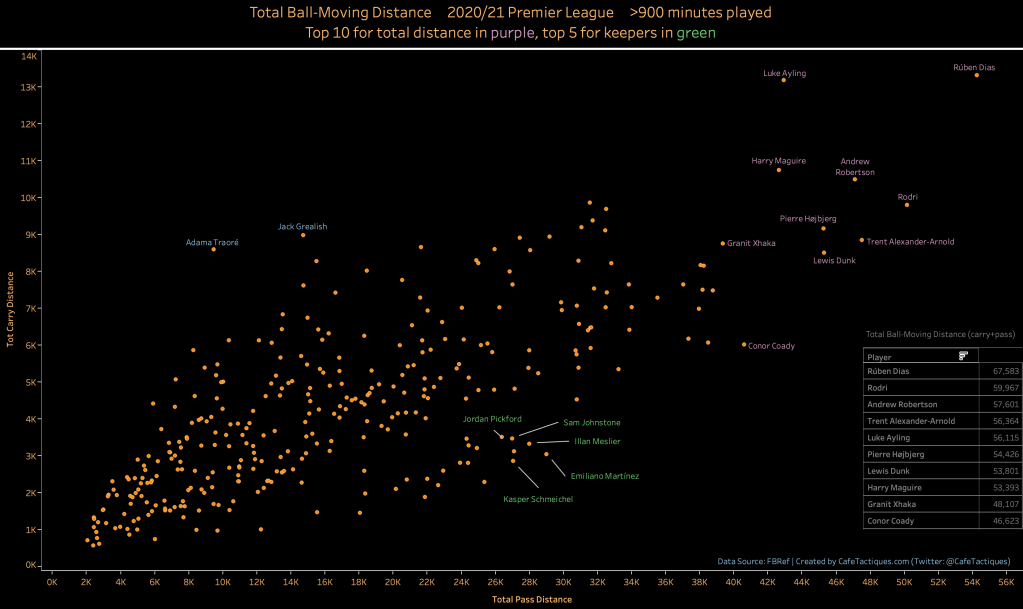
This next graph is one made purely out of interest. I wanted to see who moved the ball the most in the season. The graph plots a player’s total passing distance (in yards) and total carrying distance (also yards). This is not per 90 minutes, but instead total distance.
Manchester City’s Rúben Dias is a total outlier this season, moving the ball over 67,000 yards. Second place is also a Manchester City player, Rodri, with almost 60,000 yards. Next is Liverpools Andrew Robertson with about 57,600 yards. We can see the quick drop off after Dias’ number, showing how important the center back was to Pep Guardiola this season. Another player to mention is Leeds United’s Luke Ayling, who carried the ball almost as far as Dias this season, and sits 5th for total ball-moving distance. Both Ayling and Dias recorded insane ball carrying distances.
Goalkeepers are noted in green, and you can see how they form their own group in the graph. Keepers typically pass a lot each game, but also don’t run with the ball nearly as much as other players, so they are well below the trendline. The top 5 keepers that moved the ball the most this season are highlighted.
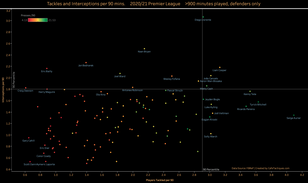
This final graph moves to defenders. It plots their tackles per 90 minutes and interceptions per 90, as well as coloring each point by the number of times per 90 minutes they press the opposition.
While there is a small trend, we can see that this graph differs from others in that there are very few players in the 90th percentile for both tackles and interceptions. Leeds United’s Liam Cooper is the player solidly in the 90th percentile for both, but Leeds’ Diego Llorente is just 90th percentile for tackles while performing well above any other layer for interceptions. Further, Llorente is one of the defenders who presses the most as well, showing not just how important he is to Leeds’ defense, but also Marcelo Bielsa’s playstyle of high-intensity pressing. This style will lead to the possibility of more tackles and interceptions. Finally, Aston Villa’s Matty Cash is the other player in the 90th percentile for both tackles and interceptions.
While Llorente solidly leads in interceptions, Tottenham’s Serge Aurier is the top player for number of opponent players tackled per 90. Given Aurier’s propensity to push high and aggressively close down players, this number makes sense. Aurier also has a high number of presses per game, so we can start to see that presses and tackles are somewhat related.
A few players, like Tottenham’s Eric Dier and Wolves’ Conor Coady are noted on the low end of the graph. Players like these record very few tackles and interceptions per 90. For some players, like Manchester City’s Aymeric Laporte, this can be due to their team’s dominance up the pitch, leaving the defenders with little work. But in Eric Dier’s case, Tottenham were not one of the best defensive sides this season, so his numbers should be cause for concern. However, players on this end of the graph also tend to not press as often as others, which could explain some of their lack of tackles and interceptions.
Final Thoughts
These graphs give us an overview of some of the top performers of the season. The first few graphs tell us a story about the teams, while the final graphs tell us a story about the individual players. The 2020/21 Premier League season was an interesting season start to finish, not least because of the lack of fans due to the ongoing COVID-19 restrictions. These graphs help shed light on some of the most interesting aspects of a great season.
Header image by Kelvin Stuttard from Pixabay.
