
Averages
Possibly the most important statistics topic to understand when you analyze football is the average. Averages (also called means) form the basis of the most-used method to compare players: per 90 minutes.
An average is essentially a representation of a sample. It is a single number that we use to give us information about some sample. It’s calculated as the sum of all your numbers divided by how many numbers you have.
The average of a set of five numbers (2,3,7,4,5), is calculated as:
(2+3+7+4+5) / 5 = 4.2
In this case, the average is 4.2.
Averages are great because they allow us to take a lot of numbers that vary (think: number of shots per game, passes per game, etc.) and boil them down to what is essentially the player’s base performance in that metric we are averaging.
How does this relate to per 90 minutes? Great question. When we talk about a player’s performance in a specific metric per 90 minutes of play, we’re essentially talking about their average performance in a game they play 90 minutes.
Let’s take passes attempted per 90′ as an example. We take the total passes the player attempted in our time frame (typically a season) and divide that by how many 90s they played (90s can be calculated by dividing a player’s total minutes played by 90). The number we get, say 60.5, is the average passes a player makes in 90 minutes.
Per 90′ is an average because we’re essentially averaging out the passes a player makes each minute they are on the field and then just multiplying that by the length of a game. This number is then the number of passes we might expect a player to attempt in a game they played the full 90′.
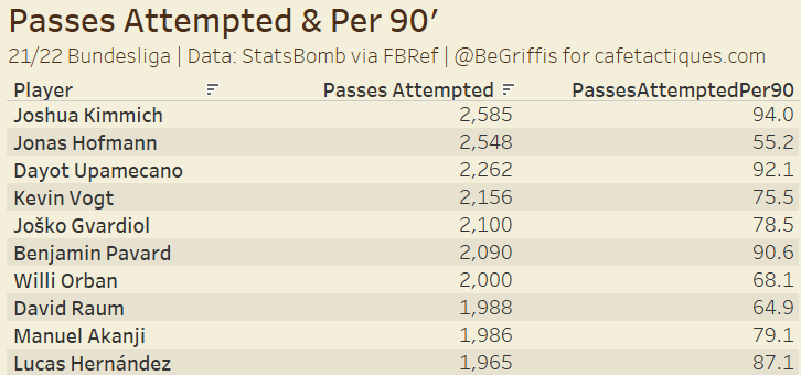
The table above shows the 10 Bundesliga players in 21/22 with the most passes attempted, and their average passes attempted per 90′.
Another type of average is pass completion percentages. We take the number of passes completed and divide that by passes attempted. It’s the same as adding up a bunch of 1s and 0s (1 for completed pass, 0 for incomplete) and dividing by how many 1s and 0s there are, going back to the initial example at the start of this section.
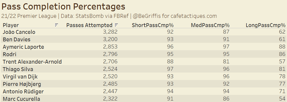
In this table above, we see the pass completion percentages for the 10 Premier League players attempting the most passes, broken down by pass length (short, medium, or long).
Averages can be used in other, similar ways, to start analyzing players’ ability. The table below looks at a player’s average expected goals (xG) per shot, not including penalties.
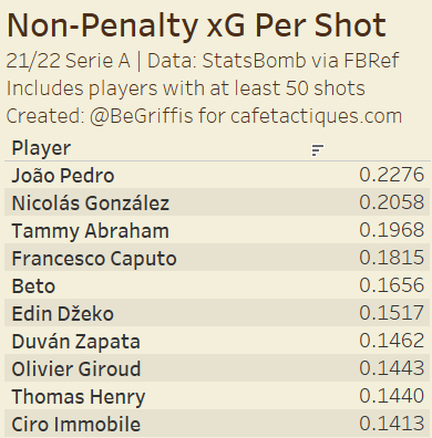
We can get this average by dividing a player’s total non-penalty xG (npxG) by their non-penalty shots. This average allows us to see what players are in the best positions, on average, when they take their shots. In the 21/22 Serie A, João Pedro of relegated Cagliari had the highest npxG per shot of players with 50 or more shots.
Medians
Of similar importance to the average is the median. While being very similar, medians and averages are different.
Medians take the middle number of a group of numbers, sorted smallest to largest. For example, the median of (1,4,2,7,4,5,9) is 4.
First, we sort the values: (1,2,4,4,5,7,9)
Then, we take the middle number. Since there are seven numbers, we take the 4th, which is 4. Three numbers on the left, three on the right, and our median in the center. The median is also called the 50th percentile, which will be covered in another section.
In the case of an even number of values, we take the simple average of the two number in the middle of the sequence to get the median. If our numbers were, for example, (1,2,4,5,7,9), our median is then (4+5)/2 = 4.5.
Medians benefit over averages for some analyses because they are not really impacted by extreme values or outliers in general. If our numbers were instead (1,2,4,4,5,7,50), the median is still 4 but the average goes from 4.6 to 10.4. Which number do you think would be best to use in this scenario?
In many cases within football data, the means and medians of our samples will be similar. Especially with a relatively large data set (think: all midfielders in the top 5 leagues), the median and mean won’t be too far apart. But we could still see outliers impact the average.
Further, with a small sample, such as just the 20 teams in the Premier League, the average and median could easily be very different. If one or two clubs have extraordinarily high or low values for a metric, the average would be adversely affected and thus the median would be a better statistic to use.
For examples and a deeper dive into the differences of averages and medians, please refer to this Twitter thread I made a while back, complete with distributions showing the differences.
Application: Scatter Plots
There are many applications for means and medians, however one application used very often is the scatter plot. Here is one short example.
Including an average or median reference line for each axis can divide your graph into four quadrants for visualizing players performing very well in neither, one, or both metrics. Let’s look at this graph below.
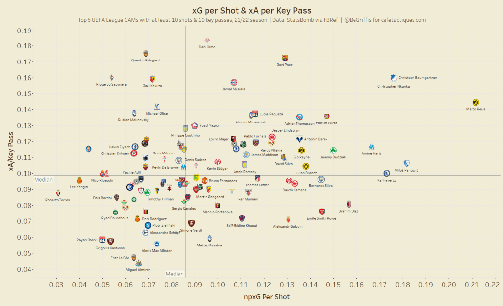
Plotting the npxG per shot and xA per key pass (pass leading directly to a shot) can begin to visualize some of the most efficient goal threat creators. Both axes are an average (average xG per shot and average xA per key pass), but the inclusion of median lines allows us to see players who are above the 50th percentile in both metrics.
The median isn’t exactly necessary for this plot, given that there’s no extreme outliers, but gives us insight into the players in the top half of performances in both metrics (and is my personal preference for this reason).
We can see players who record high xG/Shot and xA/Key Pass include Marco Reus, Gavi Paez, Jamal Musiala, Christoph Baumgartner, and Christopher Nkunku to name a few. These players are very dangerous whenever they either shoot or assist a shot. The median lines also allow us to see relatively inefficient players, including Rayan Cherki, Enzo Le Fée, and Grigoris Kastanos.
